
How to Create Luxury Magazine Editorial Layout Portraits
What this series is for
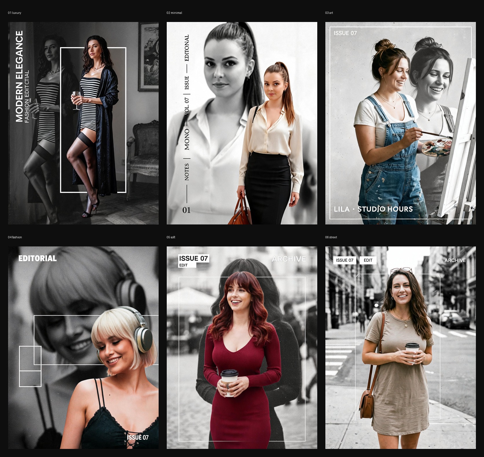
This series turns one clean portrait into a premium editorial layout image that feels like a fashion magazine cover, an art-book spread, or a minimalist visual campaign page.
The visual formula is simple but powerful:
- Use one clear portrait as the identity source.
- Rebuild the subject as a sharp color foreground figure.
- Add a second black-and-white version of the same subject as a blurred background layer.
- Use thin white frames, issue text, archive text, or editorial labels.
- Finish with subtle print grain, matte contrast, and expensive negative space.
The result should feel restrained, polished, and highly designed rather than flashy or over-processed.
Best photos to upload
Upload one clear photo of a single person. Half-body, three-quarter, and full-body portraits all work. The face should be visible, sharp, and unobstructed.
Good inputs:
- clean portrait or outfit shot
- natural or professional light
- visible hairline and jawline
- minimal blur
- one clear main subject
Avoid:
- group photos
- heavy sunglasses
- face-covering hands
- tiny faces in wide scenes
- screenshots
- child photos
- aggressive beauty filters
Core method
Every strong magazine-layout result in this series follows the same structure:
Layer 1: Identity
Keep the uploaded person's exact face identity, age impression, hairstyle, skin tone, and overall temperament stable.
Layer 2: Monochrome background portrait
Build a large grayscale duplicate of the same subject behind the main figure. This background version should be softer, more blurred, and lower contrast.
Layer 3: Sharp color subject
Place a crisp color version of the subject in front. This layer carries the outfit, pose, and scene realism.
Layer 4: Editorial graphics
Use sparse typography only. Thin white frames, issue numbers, archive text, short labels, or vertical editorial text are enough.
Layer 5: Print finish
Add subtle grain, light paper noise, soft matte contrast, and a premium fashion-editorial finish.
Universal prompt template
Start with this structure:
Use the uploaded portrait as the only identity source. Preserve the person's exact face identity, age impression, hairstyle, skin tone, expression, and natural body proportions.

Create a premium magazine editorial layout portrait. Build the image with a large blurred black-and-white duplicate portrait of the same subject in the background, then place a crisp color version of the subject in front as the main focal layer.

Add sparse editorial design elements only: one or two thin white frames, a minimal issue number, short English layout text, elegant negative space, and subtle print grain. Keep the result clean, expensive, restrained, and realistic.

Avoid fake brands, long readable paragraphs, chaotic collage clutter, cartoon rendering, extra fingers, broken hands, warped anatomy, muddy colors, low-resolution blur, or cheap social-template styling.
Filter-specific prompt ideas
Use these direction blocks to push the result toward a specific layout.
1. Modern Elegance
Restyle the subject into a luxury monochrome fashion editorial in an old-world interior. Use a fitted black-and-white striped dress or equivalent refined monochrome styling, a dark satin robe, elegant heels, and a calm confident pose. Add a large grayscale background duplicate, a tall white rectangular frame, and vertical editorial text. Keywords: luxury editorial, modern elegance, striped dress, satin robe, antique room, fashion magazine, monochrome backdrop, premium grain.
2. Mono Editorial
Create a minimalist business-fashion editorial page. Dress the subject in a cream silk blouse, black pencil skirt, and polished city styling with a leather bag. Use an oversized grayscale close-up in the background and a smaller sharp standing figure in front. Keep the page clean, quiet, and premium. Keywords: mono editorial, business fashion, gallery light, cream blouse, black skirt, vertical text, minimalist magazine, independent fashion issue.
3. Studio Hours
Create a soft art-publication portrait of a young painter in denim overalls beside an easel. Keep the smile natural and candid. Use a blurred grayscale duplicate behind the subject, very light print grain, a thin white frame, and sparse issue text. Keywords: studio hours, art editorial, painter portrait, candid smile, denim overalls, monochrome layer, paper texture, quiet magazine layout.
4. After Hours Editorial
Create a nightlife-inspired fashion editorial with a cropped portrait, platinum bob, metallic headphones, and a black lace look. The foreground subject should be sharp, while the background carries a large blurred grayscale duplicate of the same face. Use interlocking white line boxes and restrained issue text. Keywords: after hours editorial, platinum bob, metallic headphones, black lace, nightlife portrait, monochrome background, fashion crop, high-end layout.
5. Archive Red
Create a city fashion cover with a rich red knit dress and coffee-carrying street portrait energy. Add a blurred black-and-white duplicate behind the subject, a thin white frame, and small archive-style editorial text. Keep the color subject warm and vivid against a calm grayscale city background. Keywords: archive red, city fashion cover, red knit dress, coffee portrait, issue text, grayscale street layer, premium cover design, editorial archive.
6. City Notes
Create a minimal urban editorial portrait with a taupe T-shirt dress, shoulder bag, and coffee cup. Use a black-and-white blurred city street background made from the same subject, then place a sharp color standing figure in front with a thin white frame. Keywords: city notes, neutral dress, urban editorial, coffee portrait, city background, restrained layout, matte grain, modern street magazine.
Keywords that help
Use some of these keywords when you want stronger editorial control:
- luxury magazine portrait
- editorial layout
- monochrome background layer
- blurred grayscale duplicate
- thin white frame
- issue text
- archive text
- independent fashion magazine
- matte contrast
- premium print grain
- art-book finish
- minimal typography
- negative space
- commercial editorial lighting
- premium city portrait
- quiet fashion cover
- layered poster composition
How to avoid weak results
If the result feels too generic, add a more specific wardrobe and setting.
If the result feels too busy, remove extra objects and ask for sparse typography only.
If the layout feels cheap, replace words like "poster" or "social graphic" with:
- premium editorial layout
- independent fashion magazine page
- art-book interior spread
- restrained luxury cover
If the background is too sharp, explicitly ask for:
large blurred black-and-white duplicate portrait in the background
If the hands fail, add:
hands must remain natural, anatomically correct, and limited to normal finger count
Recommended workflow
- Start with one clean portrait.
- Choose one layout direction from this series.
- Generate one result first.
- If the face is stable but the layout is weak, strengthen the editorial keywords.
- If the layout is strong but the identity drifts, simplify the scene and restate identity preservation more clearly.
- Use the strongest result as a reference for the next round if you want tighter consistency.
Final note
The best results in this series do not come from writing more random detail. They come from controlling hierarchy:
- identity first
- monochrome background second
- clean subject separation third
- sparse editorial graphics fourth
- print texture last
That order is what makes the image feel like a magazine page instead of a template.